13 / 25·Typography & Craft
MA
Wabi-sabi tea house. The pause between things, set in type.
About the work
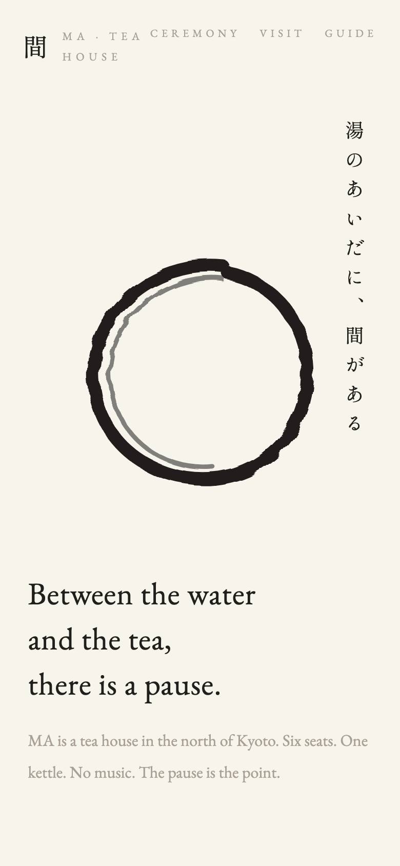
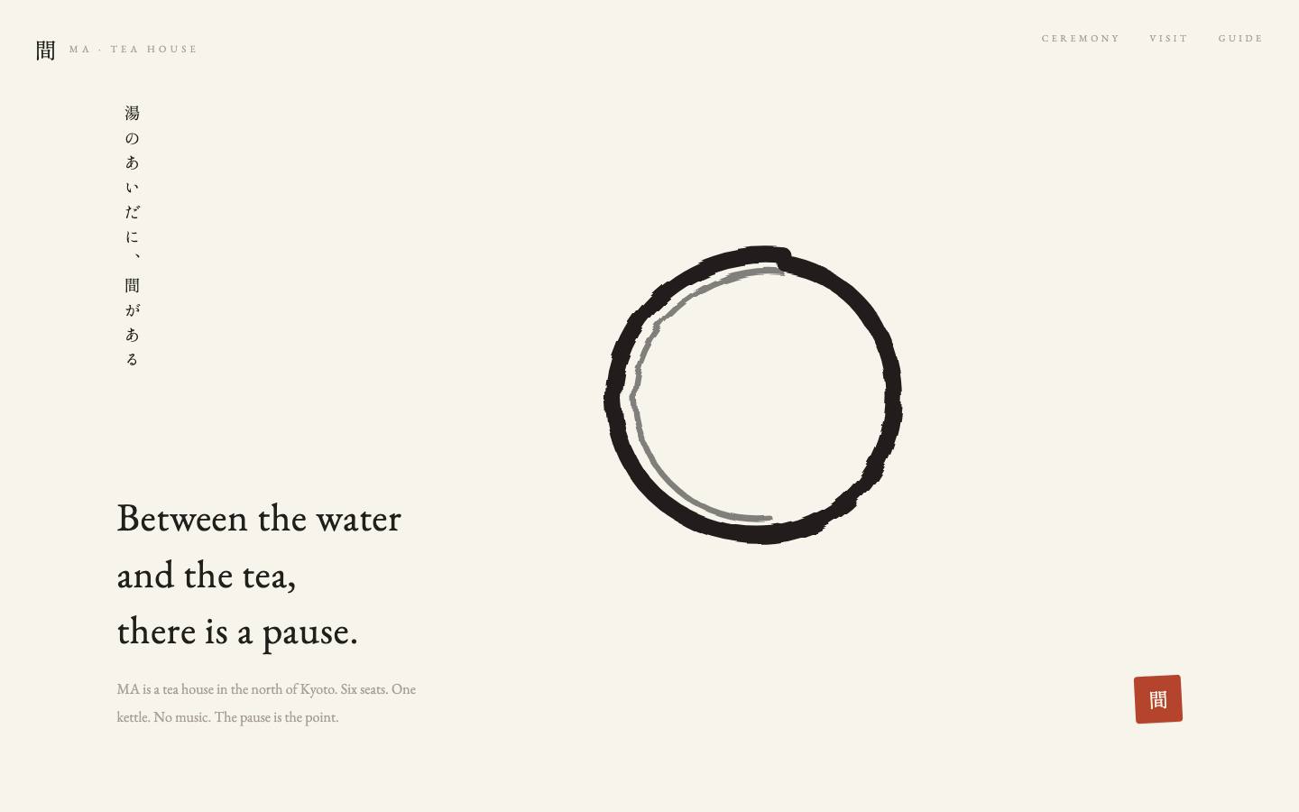
A tea house site built on negative space. A two-stroke ensō is drawn with turbulence-displaced brush texture, Japanese text runs vertically as it should, and one red seal is the only ornament the page allows itself.
How it was made
Most of the work was removal. Each pass took something away — a divider, an animation, a second accent — until what remained was the ensō, the type and the pause. The brush filter was tuned so the stroke ends dry, as ink does.
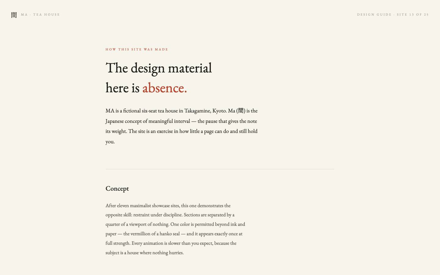
Like every work in the exhibition, it passed three full iteration passes — a visual critique, a deepening pass, and a QA pass at 390px with reduced motion and zero console errors — and documents itself in its own build guide.
Key features
- Ensō drawn in two strokes through an feTurbulence brush filter
- Vertical-rl Japanese setting alongside the Latin column
- A single hanko seal as the page's only accent
- Whitespace treated as the primary layout material
Technology
- SVG filters
- CSS writing modes
- Restraint
In its own light